Color
The Color page is dedicated to defining the default color for all items within your design. This default color is applied to all items set to “default” and serves as a basis that can be further refined through specific inputs.
The Preview
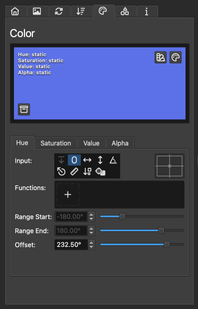
At the top of the Color page, a large rectangle provides a visual representation of how input values for hue, saturation, value, and alpha are translated into color. This preview is not a depiction of how items will be colored individually but demonstrates how the input values affect the overall color output.
As you adjust the inputs for hue, saturation, value, and alpha, labels in the top left corner of the preview update to reflect how these inputs are visually represented within the rectangle. For example, selecting the input for hue utilizes the X-position of items, changing the corresponding label to X→. This indicates a progression of hue values from left to right across the preview, providing a helpful guide for visualizing the impact of your settings. This approach is especially beneficial for inputs like “item order,” where the order→ label signifies a left-to-right representation of item sequencing.
In the top right corner of the preview, two buttons enable the selection of a static color either from a preset list or via the operating system’s color picker. Using these buttons sets all four color parts’ inputs to zero, with an offset to generate a static color.
The Preset Window
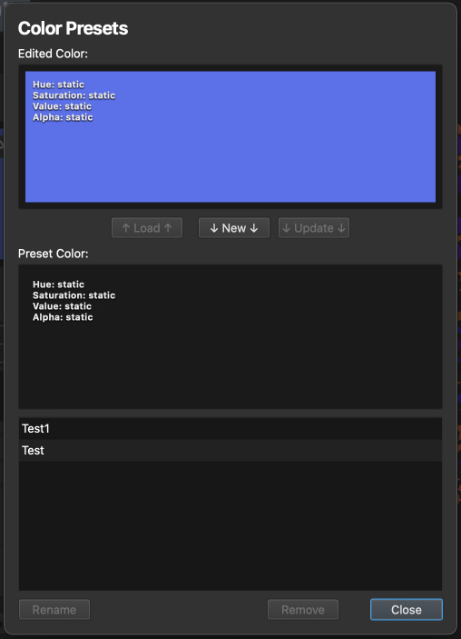
The Color Presets window facilitates the saving and loading of dynamic color presets you’ve crafted. It also serves as a convenient tool for preserving specific dynamic color effects during experimentation, allowing you to easily revisit them later.
This window features two large preview rectangles at the top, showcasing the currently edited color above and the selected preset below. Note that these previews might not accurately reflect colors influenced by default color inputs.
Situated between the preview rectangles are three buttons—↑ Load ↑, ↓ New ↓, and ↓ Update ↓—with arrows indicating the direction of their respective actions:
↑ Load ↑: Overwrites the currently edited color with a selected preset.
↓ New ↓: Saves the currently edited color as a new preset.
↓ Update ↓: Updates the selected preset with the currently edited color.
Three more buttons at the window’s bottom include:
Rename: Allows renaming of the selected color preset.
Remove: Deletes the selected preset.
Close: Exits the preset window.
Adjusting the Colour Settings
Directly below the preview rectangle are four tabs named Hue, Saturation, Value, and Alpha. Each tab hosts controls for adjusting the dynamic value corresponding to its part of the color configuration in the HSV (Hue, Saturation, Value) model plus Alpha for transparency.
HSV and Alpha Explained
Hue: Determines the color type, ranging from 0 to 360 degrees on the color wheel.
Saturation: Controls the intensity of the color, from pure color (100%) to gray (0%).
Value: Adjusts the brightness of the color, from dark (0%) to full brightness (100%).
Alpha: Manages the opacity of the color, with 0% being fully transparent and 100% fully opaque.
These settings enable precise control over the color characteristics of your items, allowing for the creation of rich and varied visual effects.
Dynamic Values
For an in-depth understanding of dynamic values and their impact on color settings, please see the Dynamic Values chapter. This section offers valuable insights into leveraging dynamic values for crafting visually captivating color effects and patterns.