Items
In the Pattern Generator, items are the fundamental components placed on the canvas to create intricate and beautiful patterns. The Items page is where you specify the shape, size, and quantity of the individual items that the generator will place on the canvas. Additionally, this page allows for the customization of each item’s color, rotation, and ordering.
Item List Overview
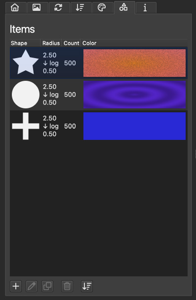
Centered on this page is a list displaying your configured items, organized into four primary columns:
Shape: Indicates the item’s shape, showing parent if it inherits the shape specified on the main page, or a preview of the custom shape selected.
Radius: Displays the fixed radius of the item in millimeters or, for dynamic designs, the start and end values of the radius along with the name of the transition function applied.
Count: Reveals the number of times an item will be placed on the canvas.
Color: Shows parent if the item uses the default color defined on the color page, or a preview of the custom color chosen.
Interacting with the list is intuitive: click an entry to select it, double-click to edit, and right-click to access a context menu with options for quick edits, presets, and other actions.
Below the item list, a series of five buttons provides additional controls:
: The plus button adds a new item to the list.
: The pencil icon opens the edit window for the selected item.
: The two rectangles icon duplicates the highlighted item.
: The trash can icon removes the selected item from the list.
: The final button sorts the items to reflect the approximate order in which the generator will place them on the canvas.
The Item Editor
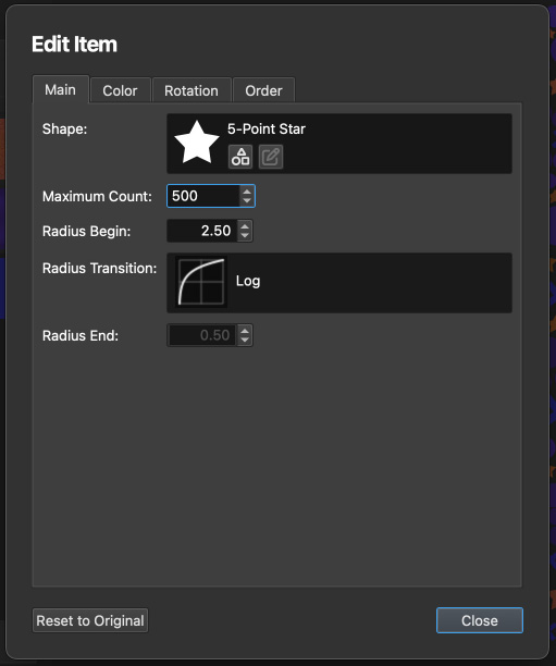
The Item Editor is a dedicated space for fine-tuning the details of each item, focusing on its shape and the maximum count allowable on the canvas.
Within the editor’s main page, you can adjust the following settings for the item:
Shape: This field allows for the selection of a custom shape for the item or setting it to default to use the project-wide shape. For more information, see the Shape Selection chapter.
Maximum Count: Defines the maximum number of this item type that the generator can place on the canvas.
Radius Begin: Sets the initial radius for all items in millimeters. If a radius transition function is applied, this value represents the starting point of the transition.
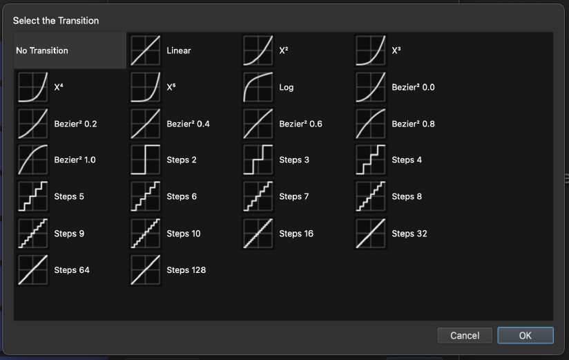
Radius Transition: Opens a dialog to choose a transition function, affecting how the item’s radius changes. Further details are provided in the Radius Transition section.
Radius End: For items with a transition function, this specifies the transition’s end radius in millimeters.
The Color Page
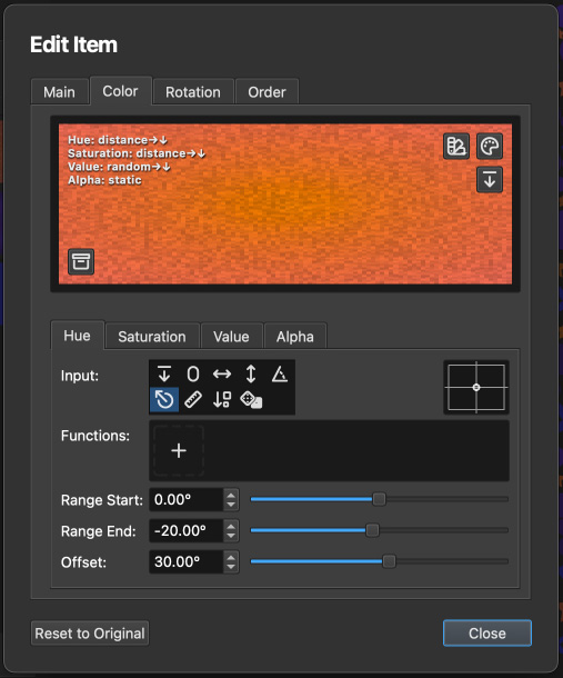
The Item Color Page enables you to customize or override the default project color set on the color page. A large rectangle at the top acts as a preview, illustrating how the color settings apply to the item. This visual aid does not show the coloring of items individually but rather demonstrates the effect of the input values on the overall color output.
Adjusting the hue, saturation, value, and alpha inputs updates the labels in the preview’s top left corner, indicating how these adjustments manifest within the preview rectangle. For instance, applying the input for hue uses the X-position of items, with the label changing to X→ to denote a left-to-right hue variation across the preview. This visualization is particularly useful for understanding how inputs like “item order” translate into the color domain, where order→ implies a left-to-right sequence. By default, all inputs are set to parent, mirroring the project’s overarching color scheme.
Two buttons in the preview’s top right corner allow for the selection of a static color, either from a preset list or through the operating system’s color picker. These options reset the four color components to zero and apply an offset to achieve a static color effect. A small button marked with a downward arrow resets all inputs to parent and all offsets to zero, effectively replicating the project’s color settings without modification.
For a deeper exploration of how dynamic values influence color adjustments, refer to the Dynamic Values chapter, which provides detailed insights into creating sophisticated color effects and patterns.
The Rotation Page
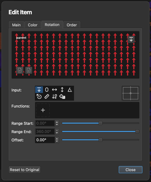
The Item Rotation Page offers a way to customize or replace the rotation settings established on the project’s main rotation page. A preview at the top provides a visual representation of how rotation affects the items, giving a conceptual understanding rather than a precise item-by-item rotation demonstration.
A small button in the preview’s top right corner, labeled with a downward arrow , resets all inputs to parent and clears any offsets, thereby adopting the project’s default rotation settings directly.
Below the preview, control elements are available for adjusting the dynamic value associated with item rotation. These adjustments enable you to specify rotation angles, enhancing the flexibility with which items are positioned on the canvas. The dynamic value set here determines the rotation angle of an item, ranging from 0º to 360º. Should these values exceed the given range, the system will automatically wrap around, continuing the rotation sequence accordingly.
The Order Page
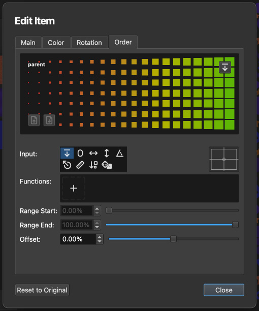
The Item Order Page enables precise control over the stacking order of items, allowing customization beyond the global settings defined on the main order page. A visual representation at the top of the page illustrates the impact of order settings on item stacking.
A button marked with a downward arrow in the preview’s top right corner resets all inputs to parent and clears offsets, effectively mirroring the global project order settings without modification.
Below the preview, you’ll find controls for setting the dynamic value related to item order. These controls allow you to specify the stacking order of items from 0% (placed at the back) to 100% (positioned at the front), ensuring a clear layering structure. For items assigned the same order value, their placement sequence is determined by the order they are generated by the tool.
Radius Transition
Selecting a radius transition function enables dynamic size variation for items placed on the canvas, starting from the initial size set in Radius Begin to the final size in Radius End. This size adjustment spans the total number of items defined in the Maximum Count field.
The choice of transition function dictates how item sizes evolve from the first placed item to the last:
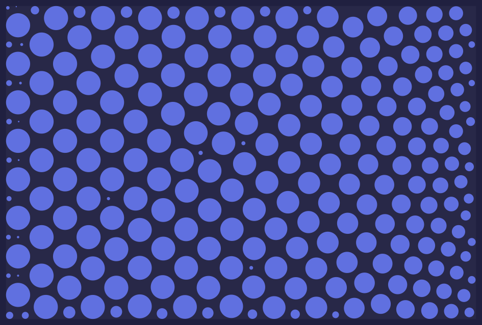
Choosing a Linear function results in a uniform size distribution between the initial and final radius sizes.
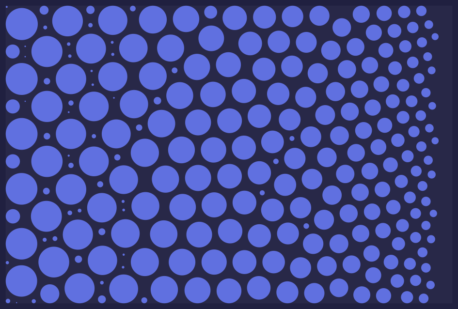
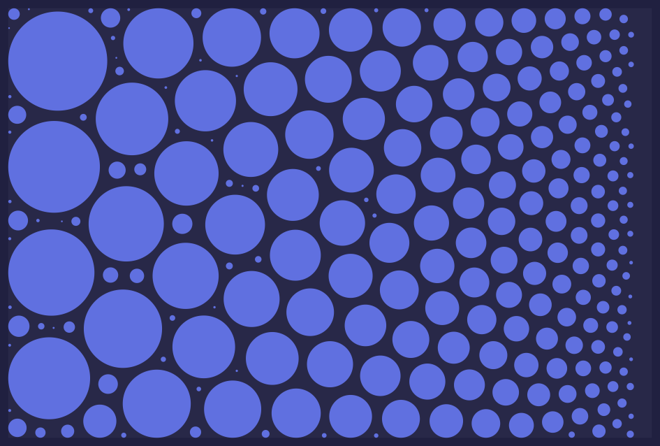
A Quadratic or Cubic function produces a distribution skewed towards larger items, decreasing the frequency of smaller sizes.
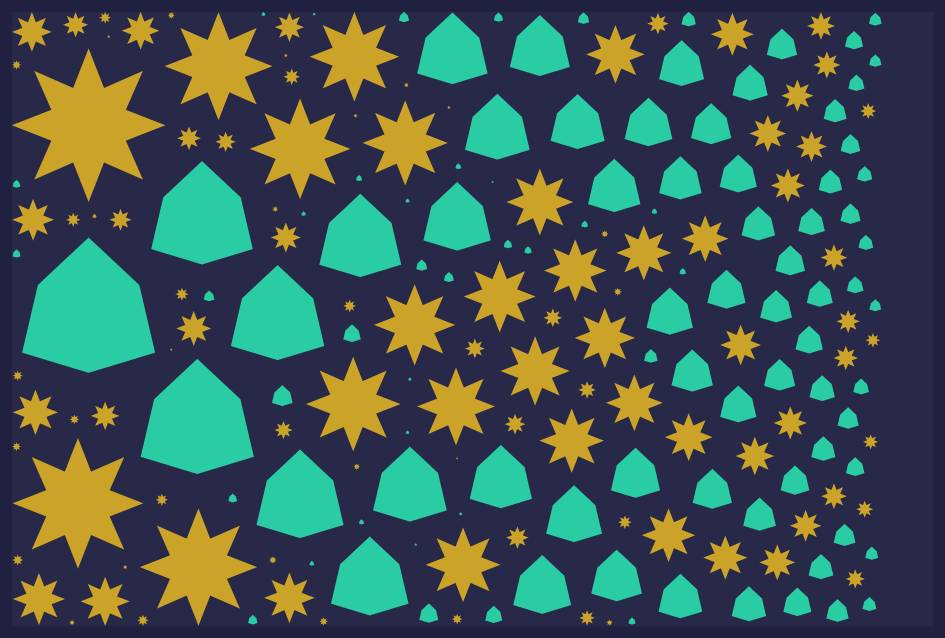
Opting for a Logarithmic function yields a distribution favoring smaller items, providing a more harmonious visual effect.
A linear radius distribution across 240 items.
A cubic (X³) radius distribution across 240 items.
A logarithmic radius distribution across 240 items.
Radius transitions from different item entries can overlap without issue. The system precalculates all item sizes and then sorts the amalgamated list by size. The example below demonstrates a combined distribution of 200 items, with two separate entries of 100 items each, utilizing identical radius transitions.